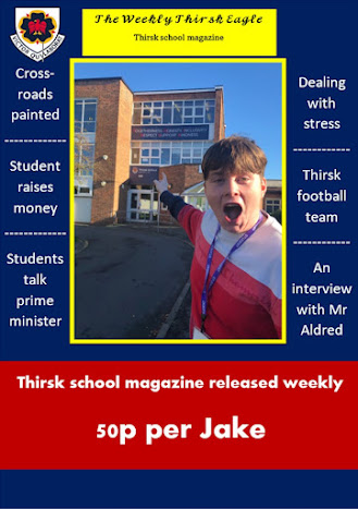
What I like about my magazine is how it's very personalized. It uses images of the students that doesn't look like they are forced into doing it, their expressions are natural and believable. I think the colour scheme works very well here, it represents the school and is a nice combination on the magazine. I specifically picked a darker shade for the red and blue as not only is that the Thirsk colours but because it would be too bright and ugly if I used light blue and red, the yellow being light is good because I haven't used that colour as much so it gives the whole thing a nice accent not being completely dark.
For the things I would change/add, first I would add a border around the whole thing as most magazines have one and it would look better in my opinion, I'd stick with the colour scheme of red, blue and yellow and probably make it that red colour. Next, I would use a more interesting font for the subheadings as it is just the basic Word font, I wouldn't make it too complex easy enough for anyone to read but also less basic to read. I would also like to fill in the empty space on the front cover, which is the top right and bottom strip, I don't exactly know what I would put in the top right maybe the Thirsk logo again or perhaps the barcode or magazine number since I didn't put those on.


